
The Challenge
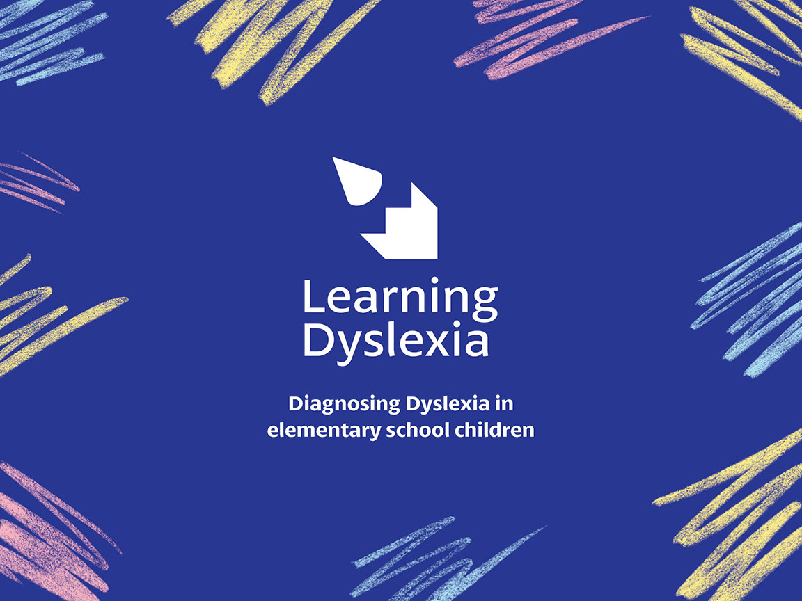
I designed branding and print collateral for a made-up company to help an issue in society for a university project . I chose to address the lack of awareness and education in elementary schools about dyslexia.
The Outcome
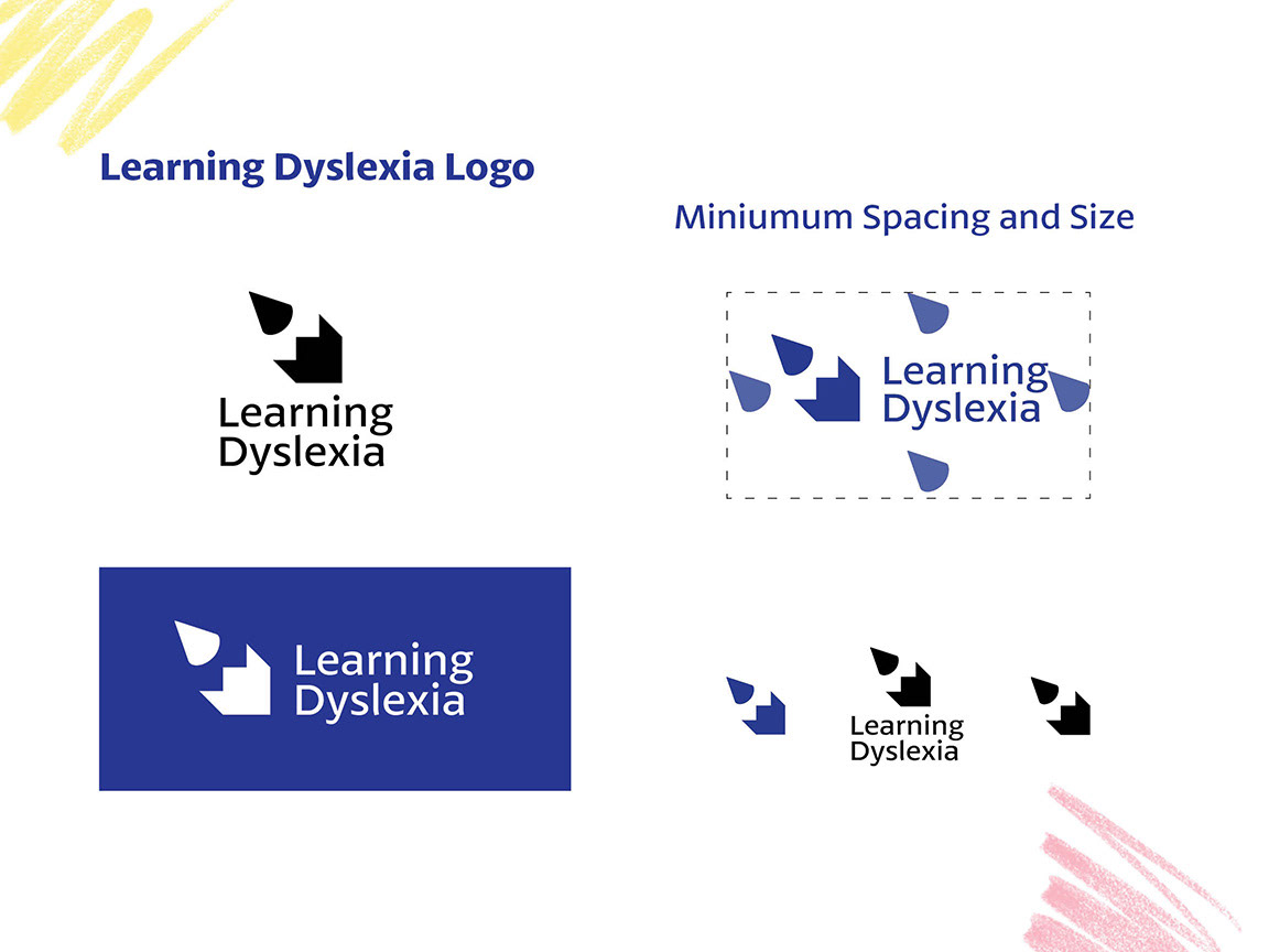
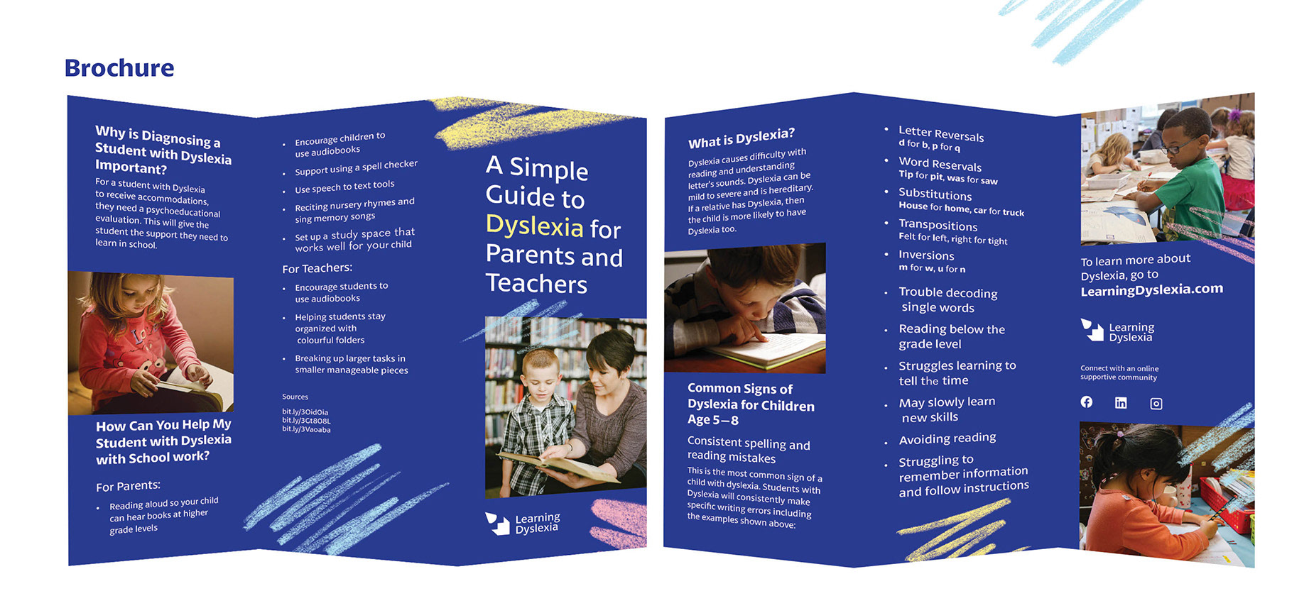
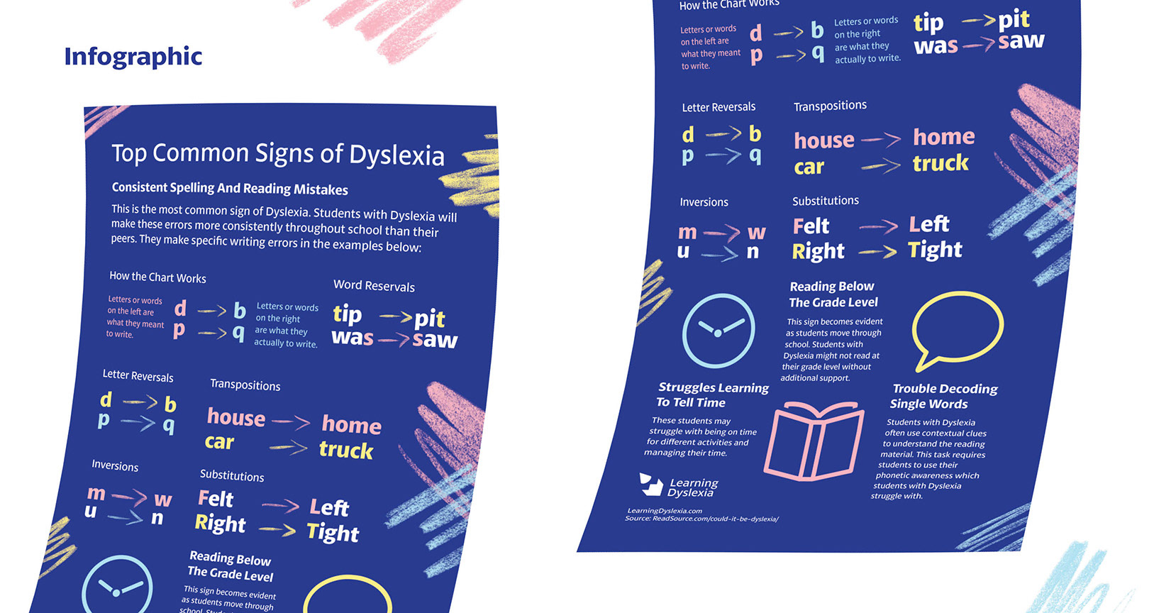
I created a logo with variations, brand guidelines, illustrative elements, an icon set, two infographic posters, a brochure, a dyslexia screening test and a website. The logo was created from two shapes: a pencil and a staircase. The pencil signifying the tool used in writing. The staircase signifying step-by-step improvement and learning. The brand's sans serif font has open counters, a high x-height and distinct lowercase letters to increase reading accessibility.
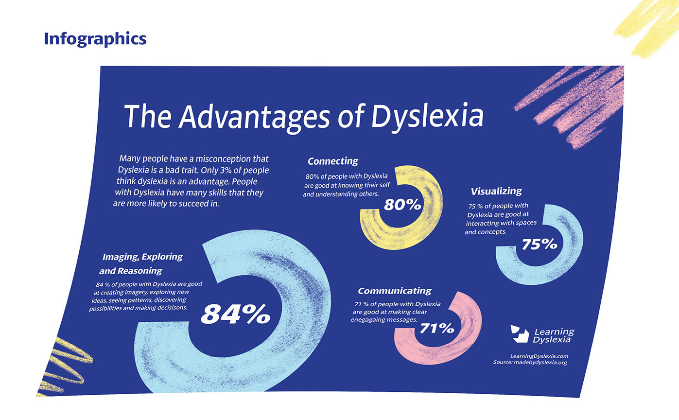
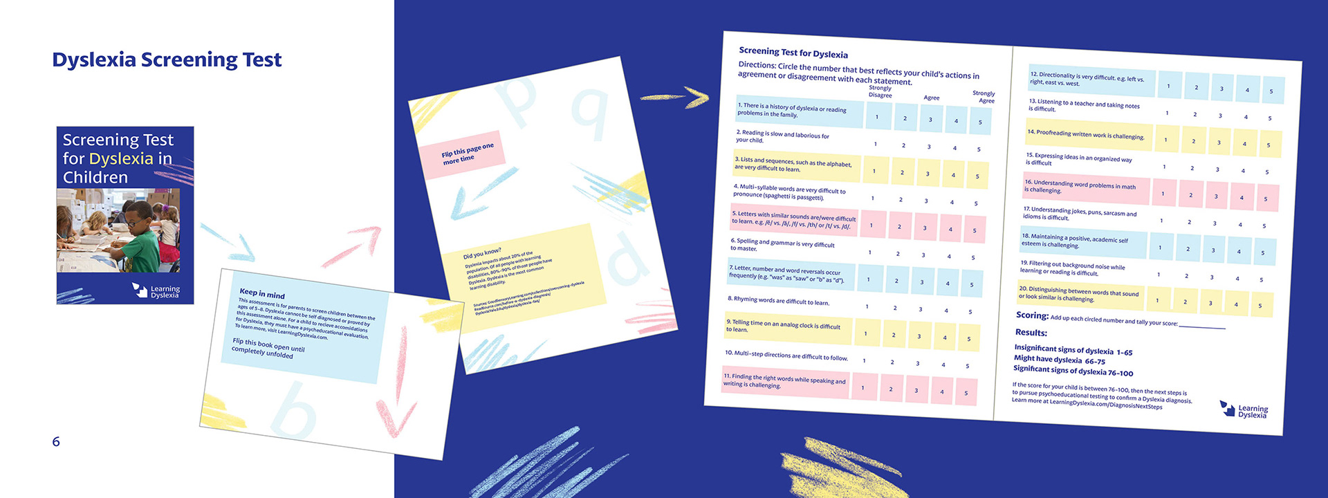
The posters were created for elementary school classrooms and daycares. The brochure was created for parents or teachers to be able to identify a child with dyslexia. The pocket size screening test for dyslexia unfolds into a two page booklet for parents to fill out for their children. The test and brochure help parents determine if they should consider getting their child diagnosis or not.
The Approach
People with Dyslexia struggle with reading and writing. Because people who are diagnosed earlier in life have the best chance at succeeding in school, I focused my target audience on parents and teachers of elementary school children. Because dyslexia is hereditary, it is possible that parents in my target audience could have dyslexia as well. I focused on making dyslexia-friendly font choices.
Tools
Procreate, Illustrator and InDesign