The Project
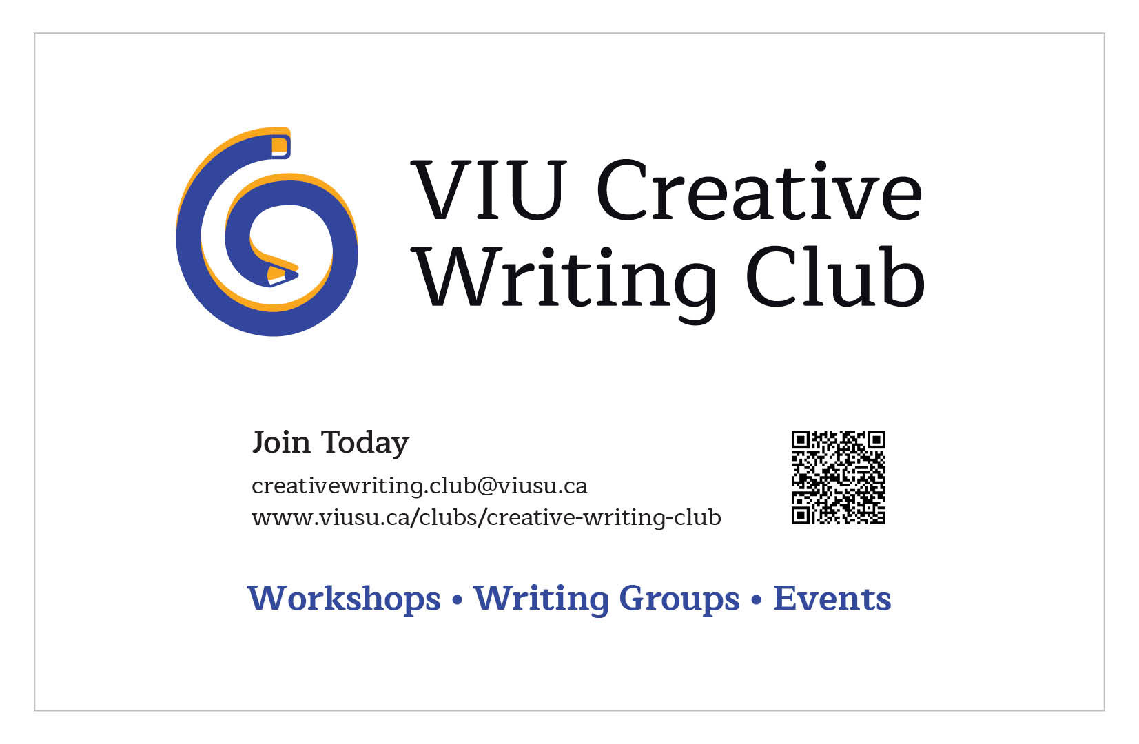
The VIU Creative Writing Club leaders required a logo and magazine ad. I created a mood board and to understand the emotional response for the logo. I did research of their online presence on the VIU website and their discord server. The logo progression had two drafts sent to the client for feedback before finalizing the full colour and black and white logo. I also designed a half page magazine ad to be displayed in Portal Magazine.
What I Did
Logo Creation
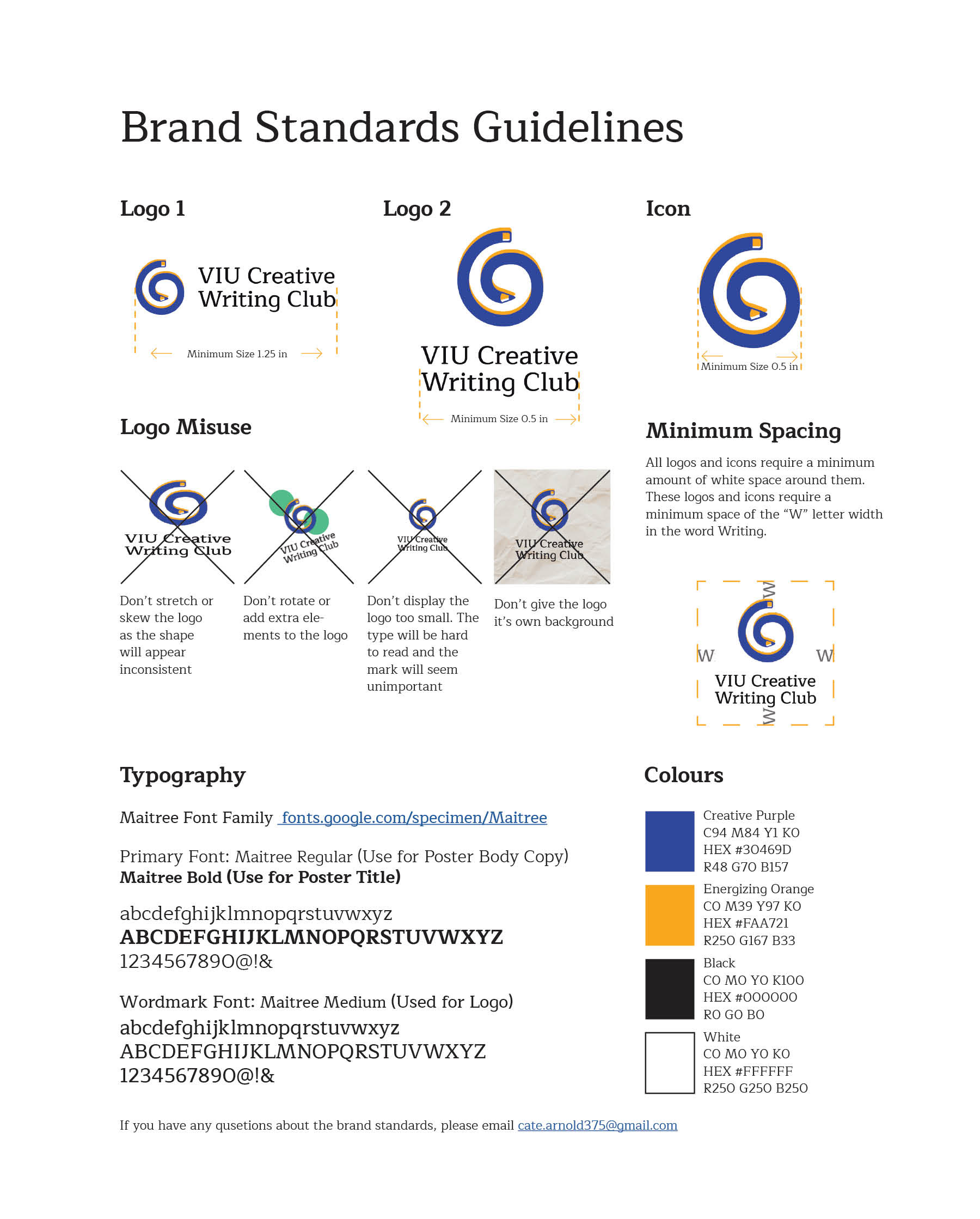
Branding and Logo Usage Guidelines
Magazine Ad
The Rationale
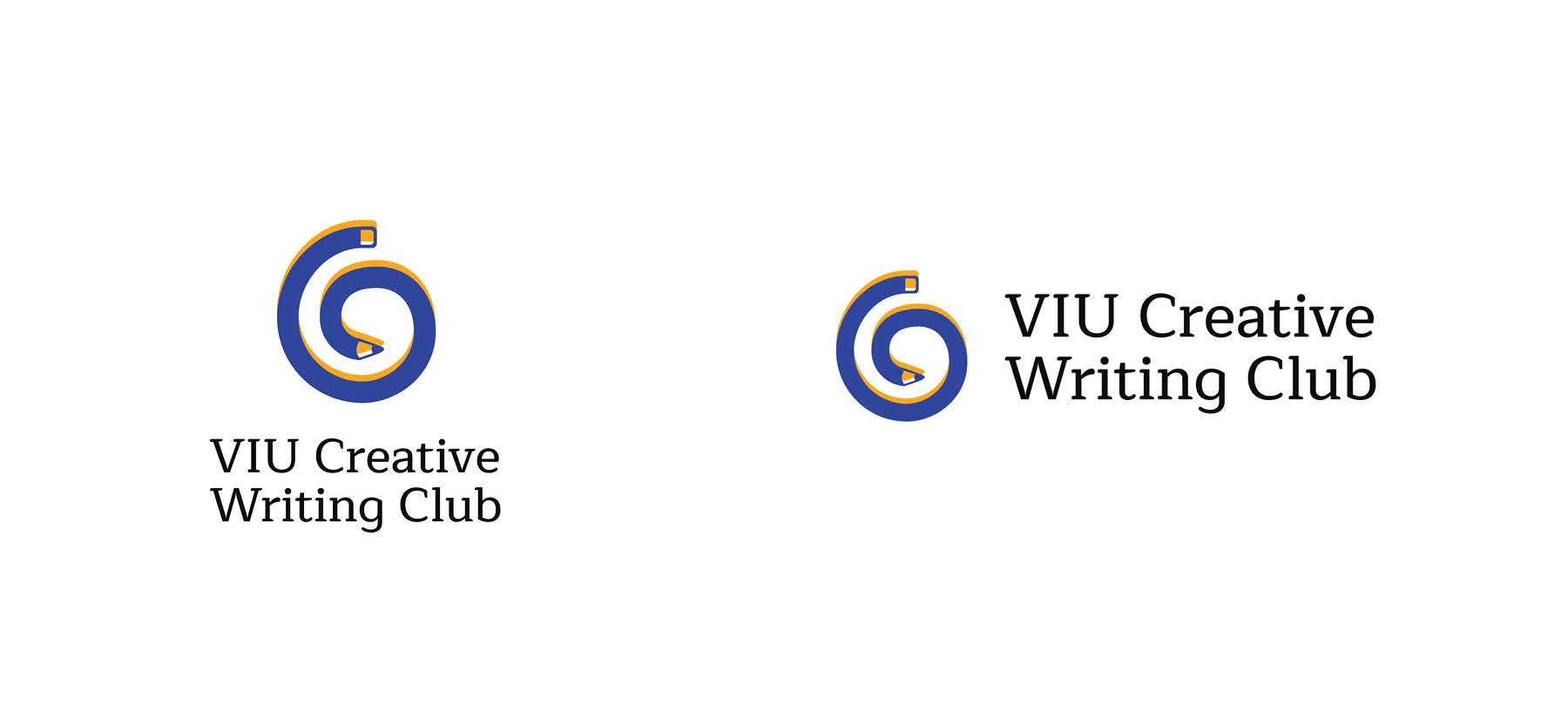
I created this logo based on shape psychology. Spirals represent creativity and the pencil represents the main tool used in writing. For the colour palette, the orange represents a friendly lively atmosphere and the purple represents creativity and curiosity. I put the orange shape slightly higher than the purple shape to create a three dimensional effect. The eraser pencil end begins at the top and curves to the left to create the curve similar to a “C” shape hinting at the name Creative Writing Club.
Client Testimonials
Cate designed a logo and magazine ad for the club, and I couldn’t be happier with the results! She really understood our brand and vision, and was able to create everything the club needed. She took the time to explain the design process, and her regular updates made this a stress-free and enjoyable experience.
- Sam Bollinger, Communications Director of the Creative Writing Club at VIU
I really appreciated Cate’s experience with the process and contractual obligations required in putting together this service. Cate was very responsive with requests for changes, and always supplied edits that exceeded my expectations in quality. I’m very pleased with our new logo!
- Jack Corfield, President of the Creative Writing Club at VIU